We’ve grown a lot since 2013. From two founders with a bold idea in Stockholm to a global team helping publishers and advertisers simplify the way they work, DanAds has come a long way. With that growth comes change, and it was time our brand caught up. This isn’t just about new colors or a shiny website. It’s about reflecting who we are today, what we stand for, and where we’re headed. Our refreshed brand identity is here to capture that spirit: confident, friendly, and human at the core.
DanAds started with a simple belief: publishers and advertisers deserved a better way to work together. Long before “self-serve infrastructure” became an industry buzzword, our founders Peo Persson and Istvan Beres saw that media owners needed more control, and advertisers, especially SMEs, needed easier, more transparent access. That vision has guided us ever since. Yes, we’re an ad tech company. But at heart, we’re really in the business of peace of mind. We want to make the lives of publishers and advertisers easier, giving them the tools to thrive through AI, automation, and self-serve technology – all delivered with a human touch.
Since 2013, we’ve:
- Increased our client base significantly
- Expanded our team across the world
- Built a solid base in the USA and Europe
- Begun our bold journey as a challenger in Asia
Our mission is clear.
To empower businesses of all sizes with an intuitive, scalable, and automated self-service advertising platform that uses AI and machine learning to simplify media buying, optimize campaign performance, and drive measurable growth through cutting-edge technology.
Our vision.
To become the global standard for self-service advertising, enabling every business to easily access and control its advertising efforts, fostering a truly democratized and efficient media landscape.
What’s new?
When we set out to refresh our brand, the goal wasn’t to reinvent DanAds – it was to better reflect who we are today and where we’re headed. Here’s how it shows up:
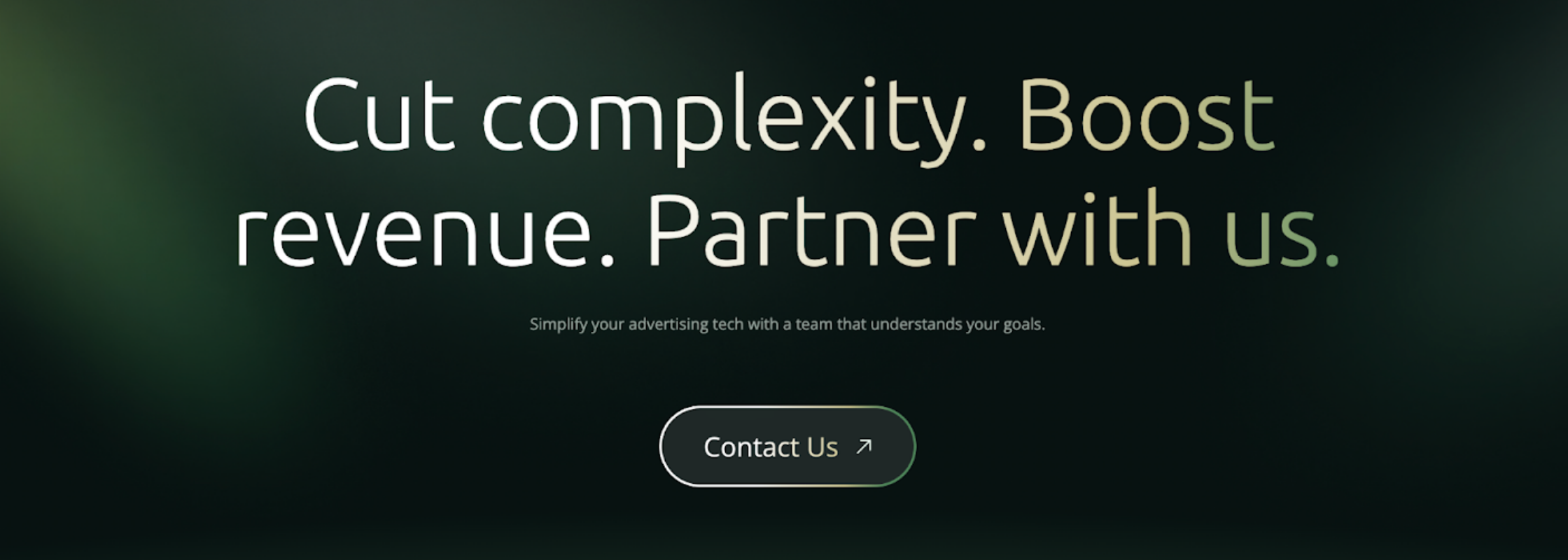
✨ Colors that pop
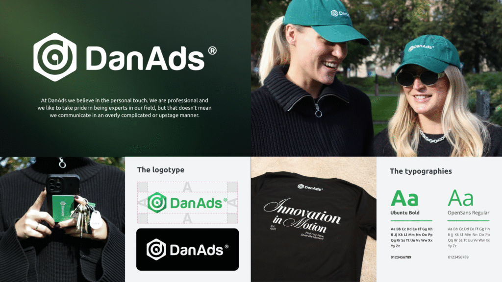
Green is still at the heart of DanAds, now richer and slightly darker for a stronger feel. We’ve added brighter accents and a touch of gold to bring fresh energy and confidence across our brand. Or as our founders like to say: “modern and bold.”
✨ A logotype, our legacy
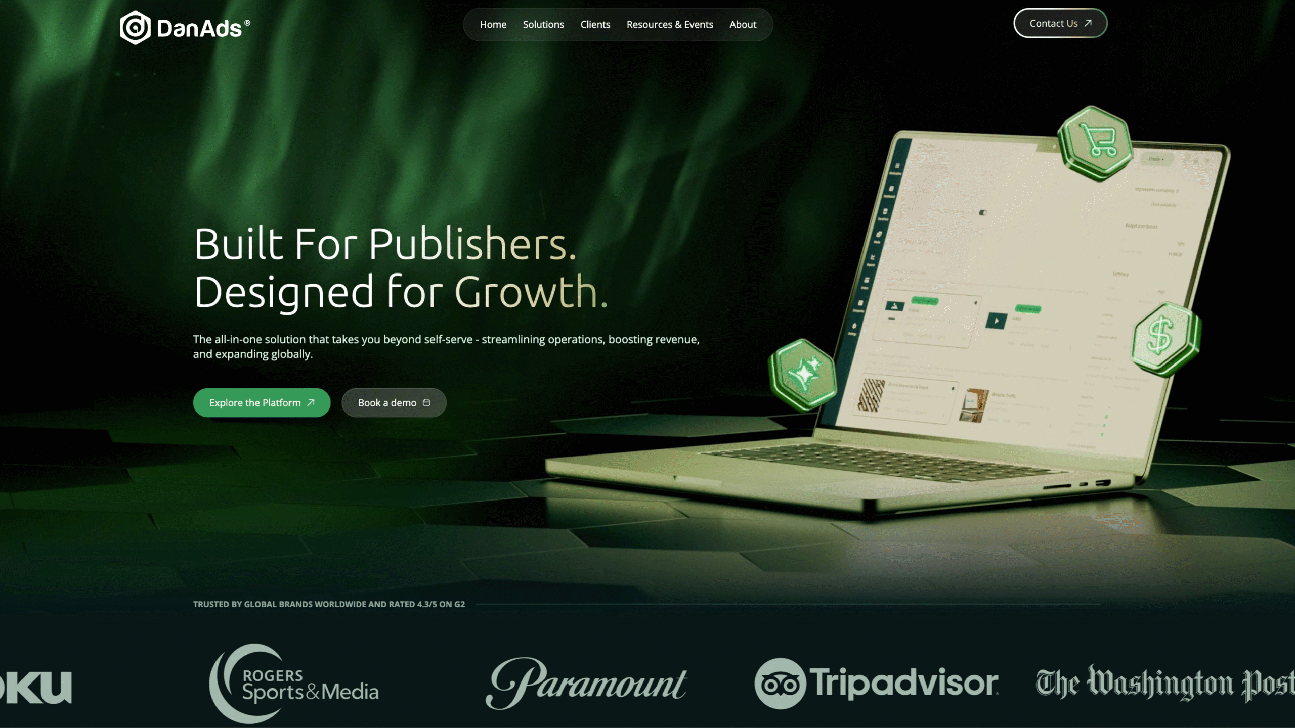
Our logo hasn’t changed – it still balances the human side with the tech side.
✨ Typography that speaks volumes
Ubuntu and Open Sans continue as our main typeface, with different weights giving us the freedom to adapt the tone for every channel.
✨ Icons with personality
We’ve built a brand-new icon library – familiar in style but infused with DanAds character and color.
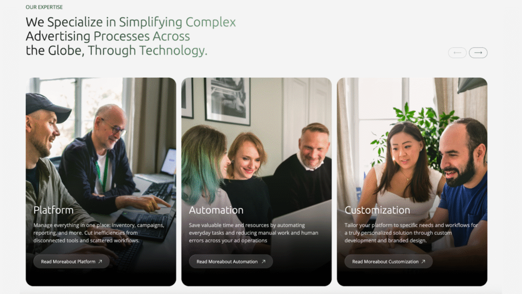
✨ Real faces, real moments
Stock photography is out. Instead, we’re showcasing our own people: natural, clear, and approachable. Because nothing represents DanAds better than the humans behind it.
Looking ahead
Work doesn’t always need to feel heavy – and neither should advertising. At DanAds, we believe in doing things with clarity, confidence, and just the right amount of playfulness. Whether it’s streamlining internal sales and financial processes or building smarter campaign tools, our goal is to make the complex simple and the serious a little lighter.
Our refreshed brand identity is the next step in that mission. It holds on to the essence of who we are while reflecting the bold, global company we’ve grown into, and the future we’re ready to shape.
With our new website live and our updated look rolling out, we’re excited for what’s next.
Fresh look. Same spirit. A future we’re building together.